Core Components:
The Center of The Universe
The five foundational components of FocusRoom — each engineered around the space-travel metaphor. From the Boarding Pass that frames every focus session to the Navigation Bar anchoring every screen, these are the building blocks that make the product feel like one cohesive mission.

The Accent Button is the primary CTA in FocusRoom. It uses a rocket icon to reinforce the space-travel metaphor and signals the main action on any screen — checking in, starting a session, or launching a mission.
| Default | White fill · black text · maximum visibility |
| Hover | 32% white glass · cream text · engaged state |
| Selected | Dark fill + F5F5F5 border · confirmed action |
| Deactivated | 20% fill · full opacity border · 55% opacity |
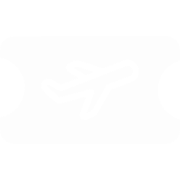
The Boarding Pass is FocusRoom's signature card — it reframes a productivity session as a space flight. Each element maps to a real boarding pass: airline → app name, departure → start time, destination → focus milestone, barcode → session token.
| Header | Airline label + class badge (Economy/Business) |
| Route | Origin planet → destination planet + flight time |
| Objectives | Task list with purple notification dots |
| Barcode | Session token: TKT-{Origin}{Dest}-{ID} |
The Date & Time Picker follows the iOS calendar sheet pattern — familiar to mobile users. It uses the system blur (100px) and a semi-transparent dark fill, making it feel native to the platform while remaining cohesive with the Orbit dark theme.
- Selected day: filled #5CB8FF circle at 12% opacity, text in blue
- First of month: blue text, no fill
- Today: subtle highlight only when not selected
- Month nav: ‹ › arrows top-right, month/year top-left
- Time: collapsible pill, RGB(118,118,128) 32% background
Planet Icons represent focus destinations — each session is a "flight" from Earth to a target planet. The further the planet, the longer the focus commitment. Icons use radial gradients that match each planet's real color palette, reinforcing the spatial metaphor.
The Navigation Bar uses a 3-tab model — Tasks, Focus, Cockpit — keeping the app's mission scope narrow and intentional. No overflow menus, no hidden items. The cockpit icon is bespoke, referencing a spacecraft viewport.
| Background | rgba(17,17,19,0.93) |
| Border | #F5F5F5 · 1px solid |
| Icon size | 48×48px touch target |
| Label | Poppins 500 · 13px |
| Active color | #38BDF9 (light blue) |
The Primary Button is the highest-priority action on any screen — "Deploy Project", "Save Coordinates", "Launch Mission". It uses a white fill with a light-blue border in its default state, making it immediately pop against the dark background without feeling aggressive.
| Default | #fff fill · 2px #38BDF9 border · black text |
| Hover | 41% black fill · 2px #0DA0E2 border · white text |
| Selected | #2E2F33 fill · 2px #2345B2 deep-blue border |
| Disabled | #9AA3B0 fill · white border · 70% opacity · not-allowed |
Use clear, action-oriented verbs — "Deploy Project", "Save Coordinates". Never stack two Primary buttons side-by-side; they'll compete for attention. One primary action per view.
The Secondary Button uses a unique "Stop Light" border system — the border color changes through states to communicate intent. Red signals the action is destructive (Cancel). Yellow warns the user on hover. Green confirms the action is locked in.
| Default | #0D131C fill · 2px #EF4444 border · muted text |
| Hover | 64% black fill · 2px #FACC14 border · white text |
| Selected | 33% black fill · 2px #22C55D border · white text |
| Disabled | Transparent fill · white border · 55% opacity |
Always pair the Secondary Button with a Primary. Use it for opt-out actions: "Cancel", "Back", "Abort Mission". Never use vague labels like "No" — the border color already signals negativity; the label should still be clear.